All Work
Brand Identity
Hive Zero is a fintech advisory firm based in Dubai offering expert services across compliance, blockchain and financial technology. A complete rebrand from a dated oval mark to an interconnected hexagon system built directly from the founder's vision of a hive that brings all services together.
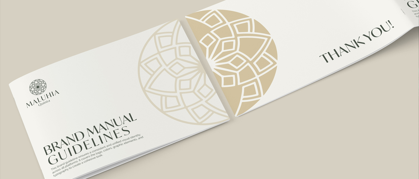
Maluhia Quinta required an identity built around calm, clarity and refined elegance. Every element of the visual system was designed to communicate stillness and trust across every touchpoint from logo to brand guidelines to print application.
Eleven years of technology consulting deserved a brand that looked the part. The existing mark was cold and generic. An orange cloud mark built on connectivity paired with Raleway in two weights gave IntelliTechne the energy and confidence their expertise had always warranted.
Atmosphere Media needed a brand that matched their ambition. The existing mark looked nothing like a serious marketing partner. A clean AM monogram, graphite palette and complete brand guidelines gave the agency the visual authority it was ready to own.
Logo Design
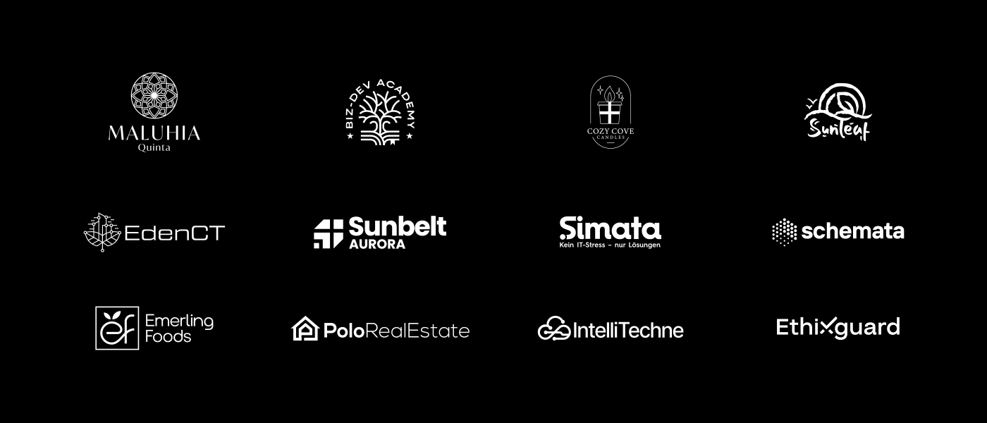
A curated collection of minimalist logo marks created for clients across multiple industries. Each mark distilled to its most essential form, clean, timeless and built to perform at every size and across every application.
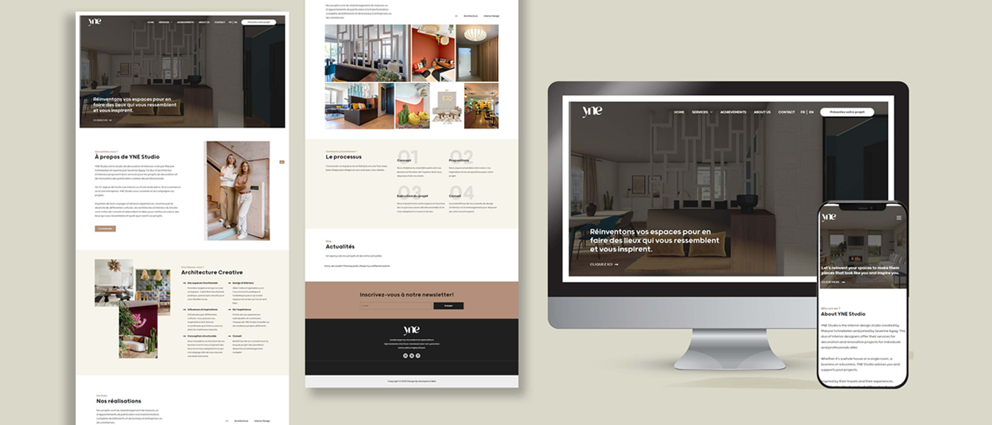
Web Design
A selection of website designs built for businesses across multiple industries. Each project focused on strong visual hierarchy, clean user experience and brand consistency carried from identity through to every screen.
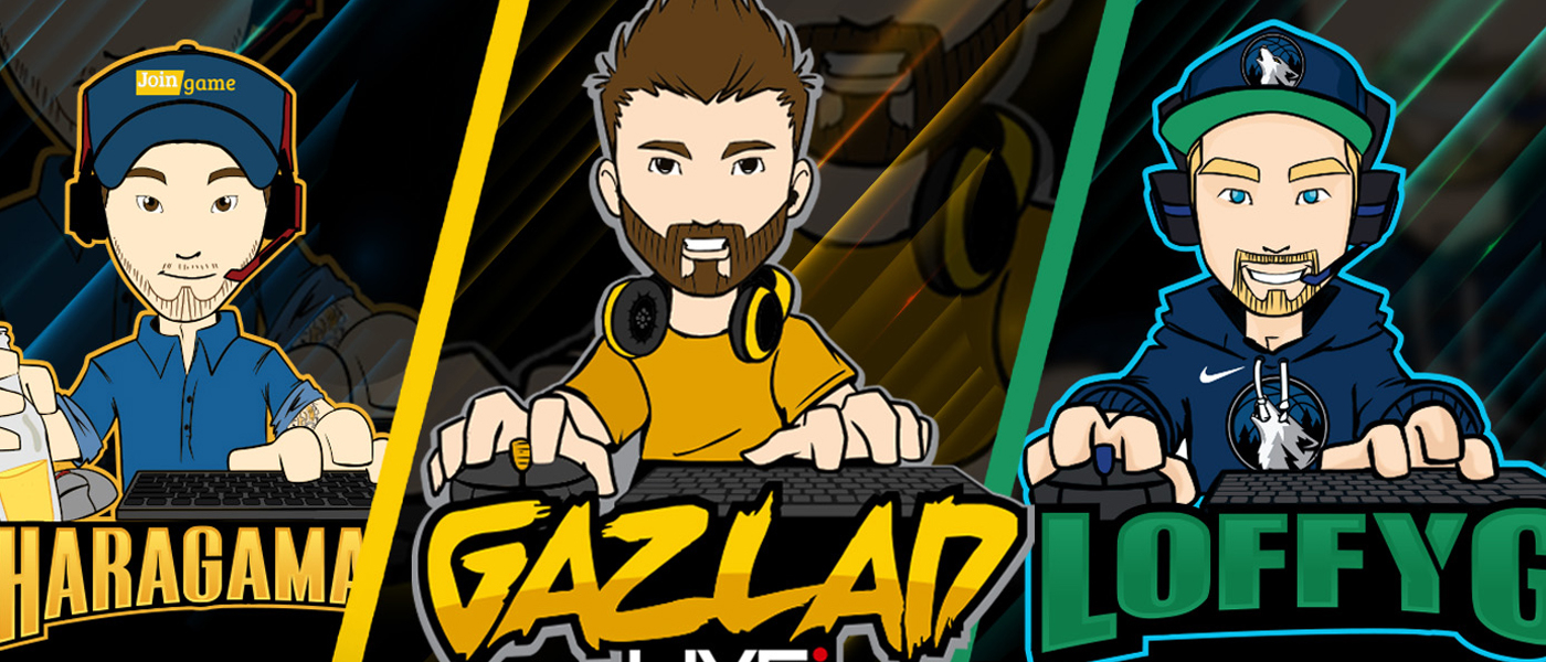
Gaming Design
A collection of mascot logos and Twitch overlay packages for streamers and gaming personalities worldwide. Every project started with a hand-drawn character sketch approved by the client before any digital work began, ensuring the final logo was always exactly what was imagined.
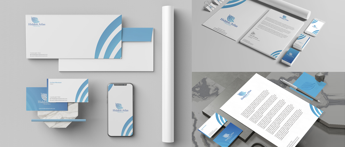
Print Design
Premium stationery suites designed to carry brand identity from screen to physical touchpoint. Business cards, letterheads, envelopes and complete print packages, every piece built with the same precision as the brand itself.
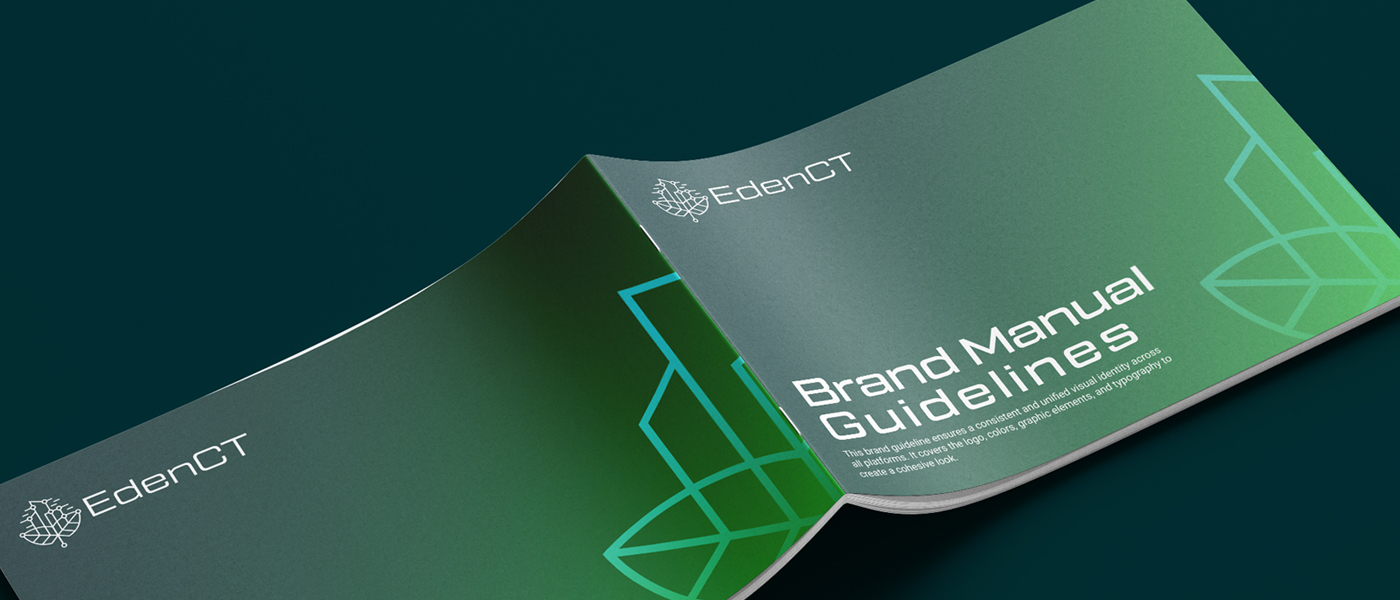
EdenCT needed a complete visual identity built to work consistently across every platform and application. A distinctive logo system, defined color palette, typography suite and full brand guidelines gave the business a visual language it could grow with.
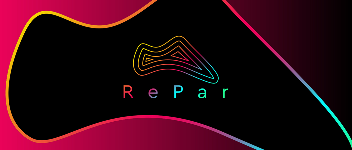
RePar is a climbing shoe resoling startup entering a niche that had been visually ignored for years. A topographic contour line mark and full-spectrum gradient palette positioned them as the first brand in the space that actually looked serious about the craft.
WANT TO SEE MORE?
1,400+ projects. 10 years of work.