Case Study 02
TENDAJI CHARITABLE FOUNDATION
Empowering children. Uplifting families.
Client
Tendaji Charitable Foundation
Sector
Charitable Foundation
Region
Canada
Year
2022
Role
Brand Identity, Guidelines, Stationery
01 — Challenge
A foundation with a mission rooted in Ghanaian culture and no identity to carry it.
Deborah Austin was launching the Tendaji Charitable Foundation from the ground up, a charity dedicated to creating opportunities for marginalized children, youth and single mothers through education, advocacy and practical support. The foundation had a name, a mission rooted in Ghanaian culture and a clear purpose. What it needed was an identity that could represent all of that with the warmth and humanity the cause deserved, while still carrying the credibility required to attract donors, partners and institutional support. This was not a corporate brief. Every visual decision had to feel human first.
02 — Approach
Build everything around the Adinkra symbol without touching it.
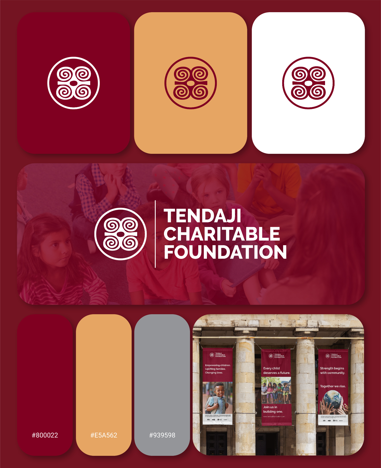
The brief came with one non-negotiable at its centre. A Ghanaian Adinkra symbol representing strength and humility. This was not a decorative choice. In Ghanaian culture the symbol carries real meaning and had to remain intact. The design responsibility was to build everything around it without touching it: framing it with a clean circle, pairing it with a wordmark that could carry its own weight beside it, and finding a colour palette that honoured the cultural significance of the mark while communicating warmth and compassion to a broader audience. Colour went through genuine exploration before landing. The initial direction was too corporate. Helping marginalized children and families is not a corporate message. It needs colours that feel warm, approachable and human. The solution was built around deep burgundy as the primary, a colour that carries both strength and warmth simultaneously, with none of the cold authority that standard charity blue palettes produce. Sand and gold was paired with it as the accent, referencing warmth, hope and the kind of light that inviting organisations carry.
03 — Solution
A cultural mark framed into a full foundation identity, ready from day one.
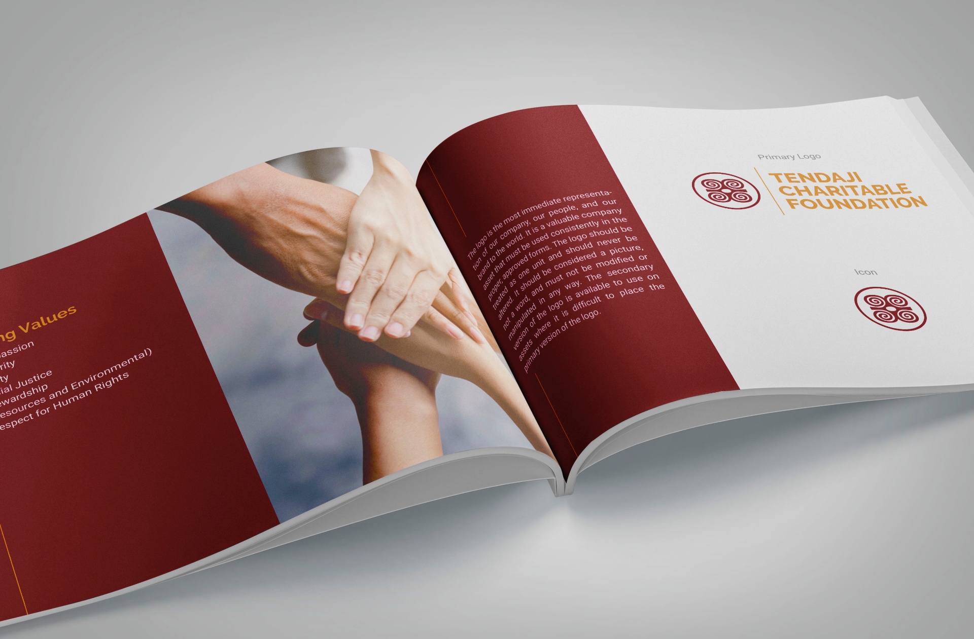
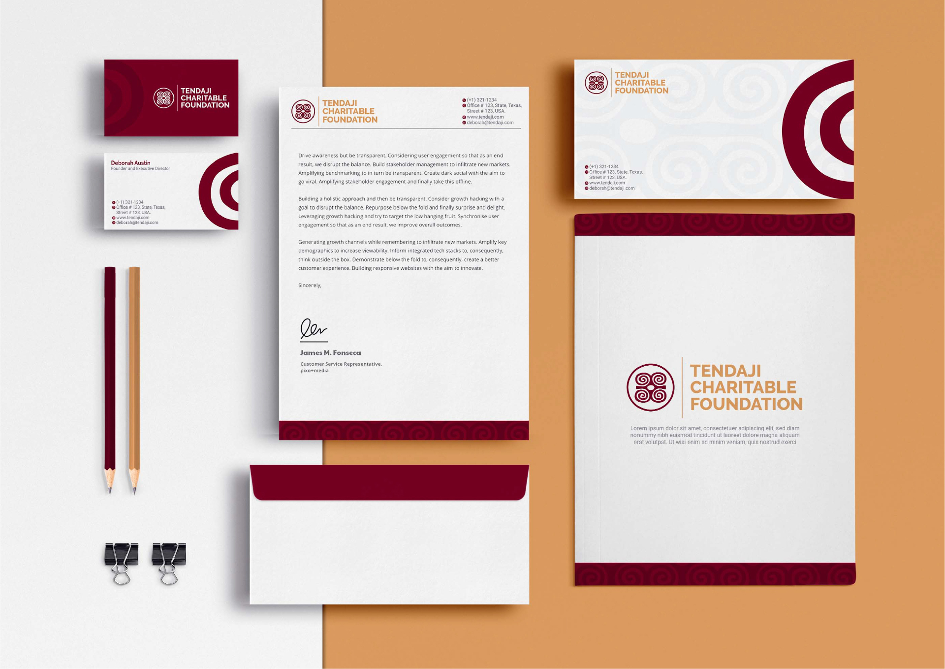
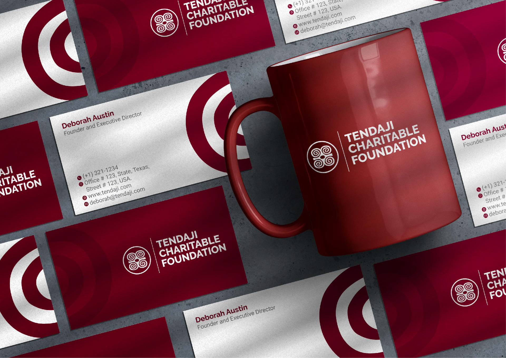
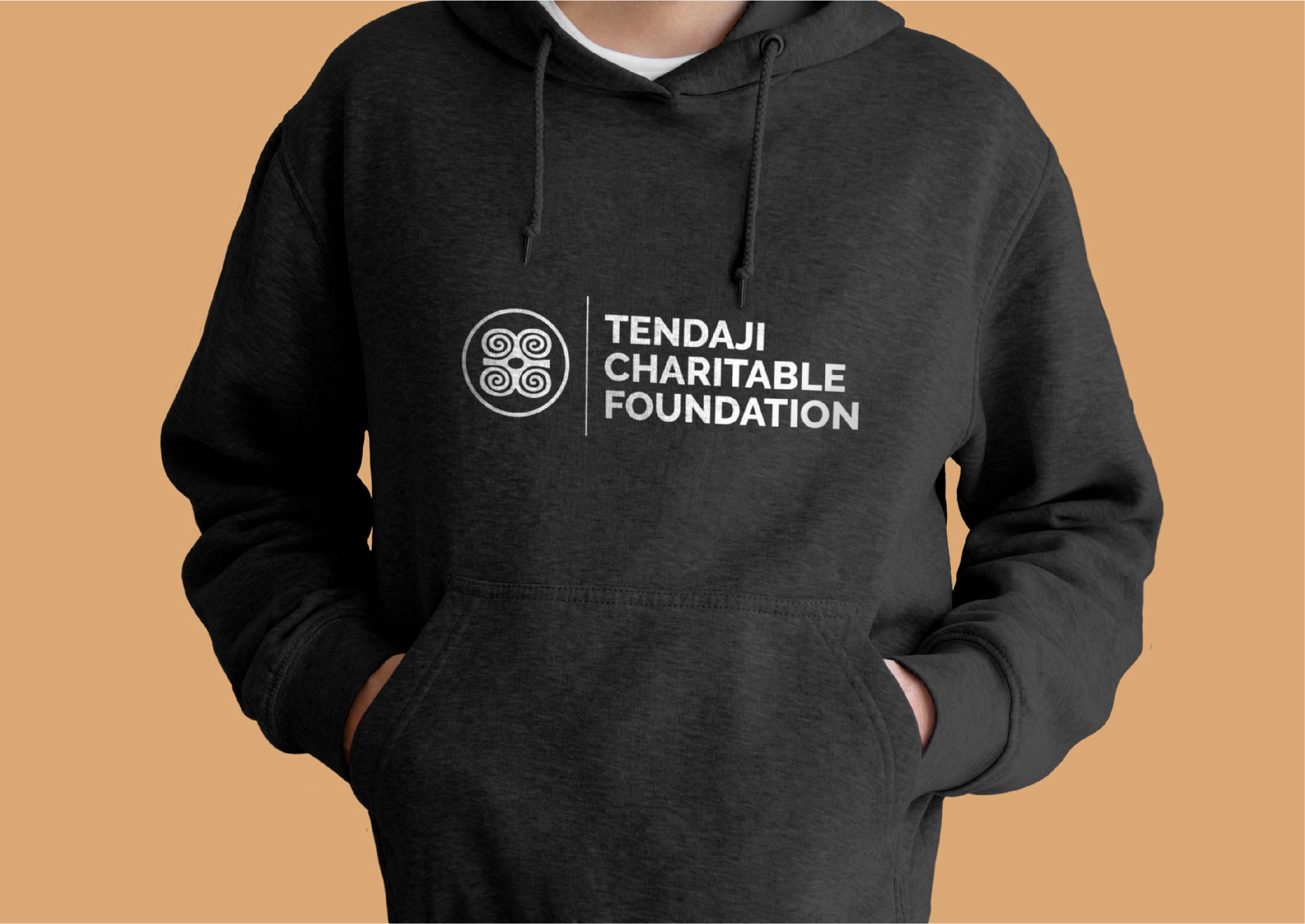
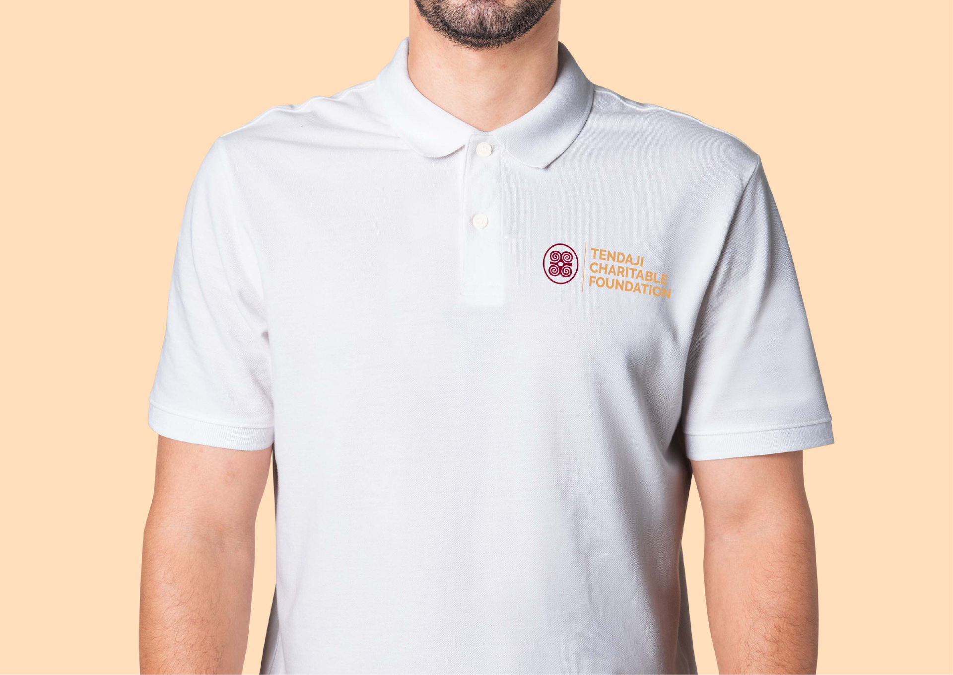
TENDAJI was set in full caps on one line with Charitable Foundation beneath it, creating a natural hierarchy between the name and the descriptor. A vertical dividing line between the symbol and the words gives the lockup structure and formality without making it feel stiff. Two logo versions were developed: the primary with the burgundy symbol and sand text, and a secondary with the sand symbol and burgundy text, so the foundation has flexibility across different background applications. A full brand guidelines document followed, covering primary and secondary logo, icon-only version, logo variations across light, dark, coloured and black backgrounds, colour palette with hex codes and print values, and typography system. Social media kit covering Facebook, LinkedIn, Instagram, Twitter and YouTube. Word letterhead template for correspondence. Merchandise templates for mugs, t-shirts and hoodies formatted for Vistaprint production. Two logo versions maintained throughout, giving the foundation visual flexibility across all its materials and platforms from day one.
04 — System
Every touchpoint carrying the same visual language.
- ◆Primary and secondary logo
- ◆Icon-only mark and logo variations
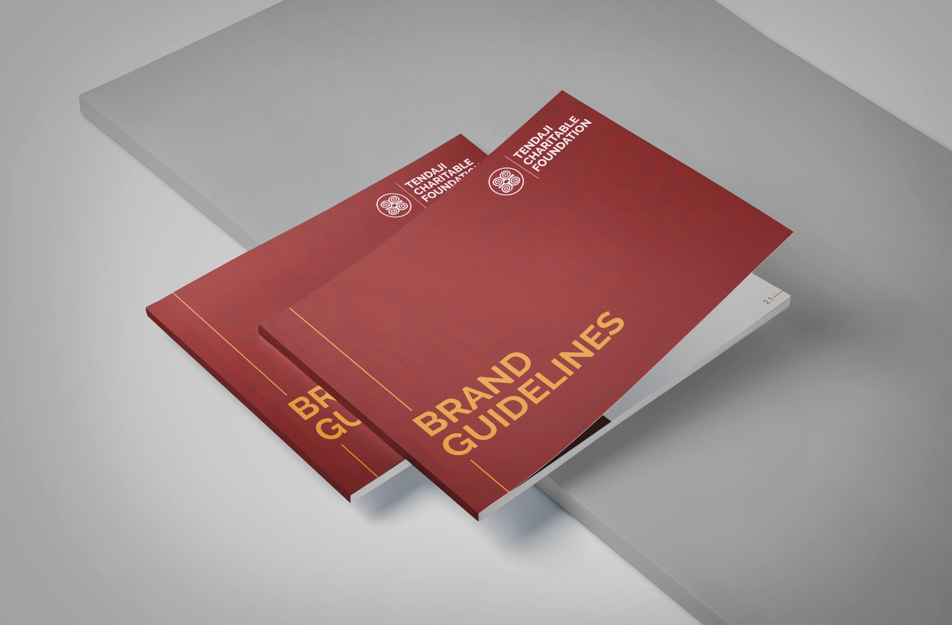
- ◆Full brand guidelines document
- ◆Colour system with hex and print values
- ◆Typography system
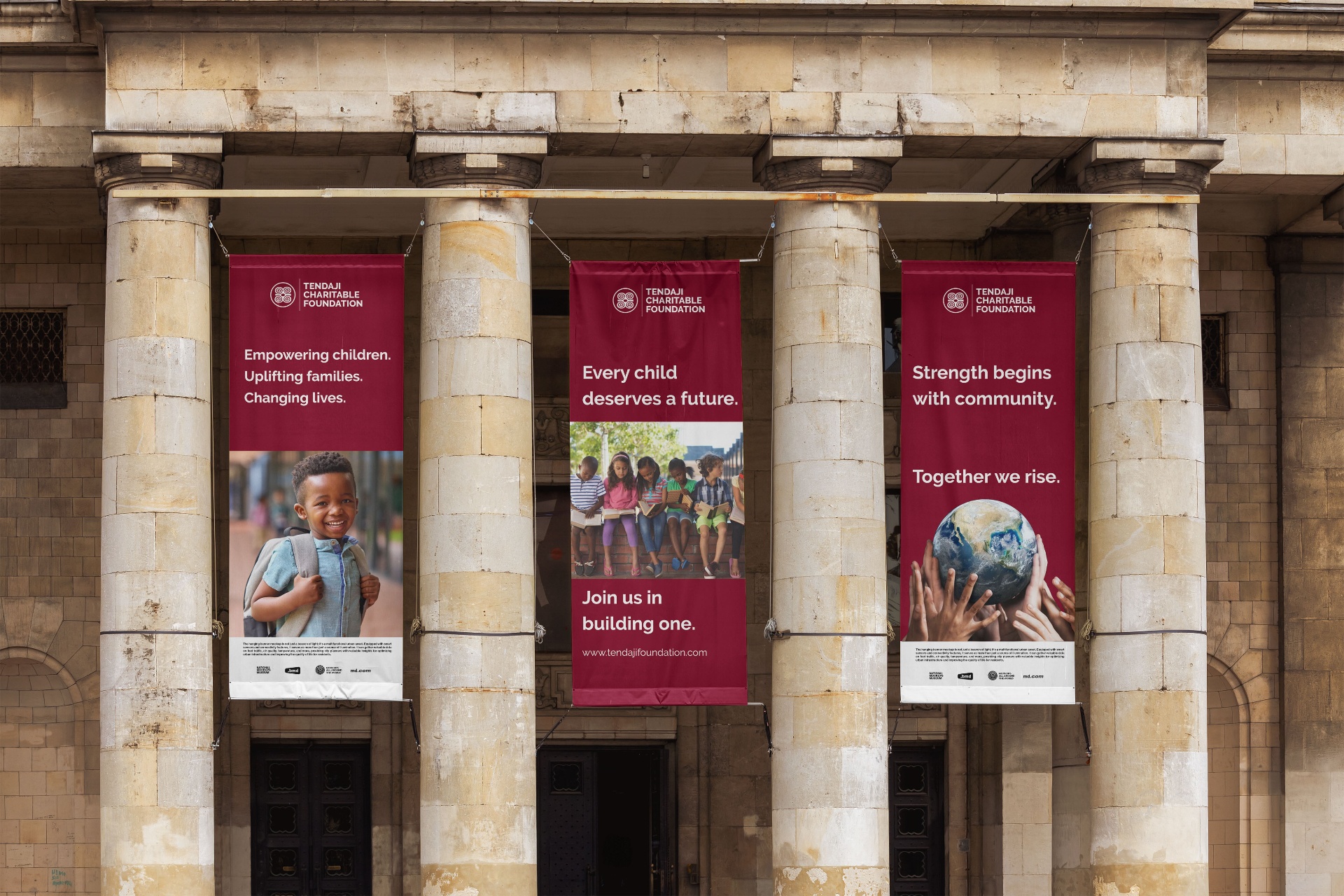
- ◆Social media kit (Facebook, LinkedIn, Instagram, Twitter, YouTube)
- ◆Word letterhead template
- ◆Merchandise templates (mugs, t-shirts, hoodies)
05 — Result
"Working with Navid was a great experience. This is the second project that I have worked on with him. I will continue to work with him in the future. He is creative, professional and delivers what the client needs."
Continue