Case Study 04
REPAR
Rebuilt from the ground up.
Client
RePar
Sector
Outdoor Recreation
Region
Climbing Shoe Resoling
Year
2024
Role
Brand Identity, Guidelines
01 — Challenge
A category that had not been touched in twenty years.
Four friends starting a climbing shoe resoling business looked at every company already doing it and saw the same thing everywhere. Rock and Resole, Yosemite Bum, Shoe Doctor. The entire niche looked outdated, utilitarian and forgettable. The founders were in their twenties, building something new, and wanted an identity that reflected that. The gap was obvious. Nobody in this space looked like a modern startup. Nobody looked like a brand a young climber would actually want to be associated with.
02 — Approach
Topographic language. Two readings in one mark.
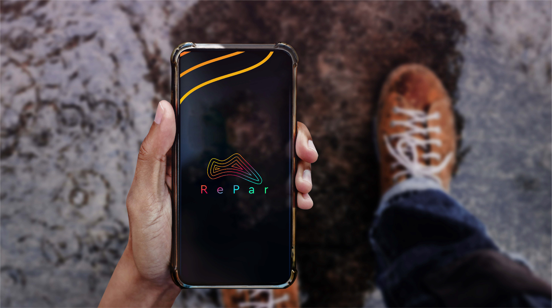
The name RePar already pointed toward the work. Resoling is rebuilding, restoring, adding new life to something worn down. The mark needed to carry that idea without illustrating it literally. Topographic mapping uses layered contour lines to represent terrain, the same terrain climbers navigate. Those lines compressed into a single abstract form read simultaneously as a shoe sole from above and as a climbing surface from the side. Two readings, one mark, both belonging to the same world.
03 — Solution
A full spectrum palette in a category built on muted earth tones.
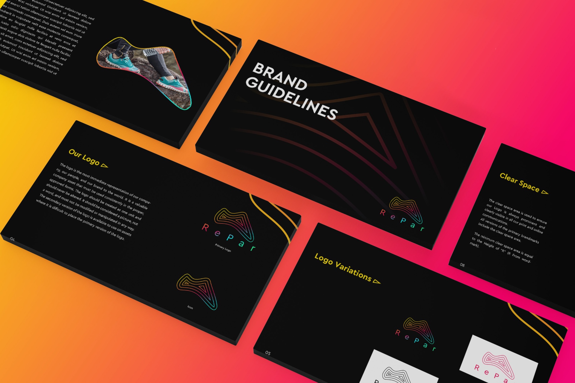
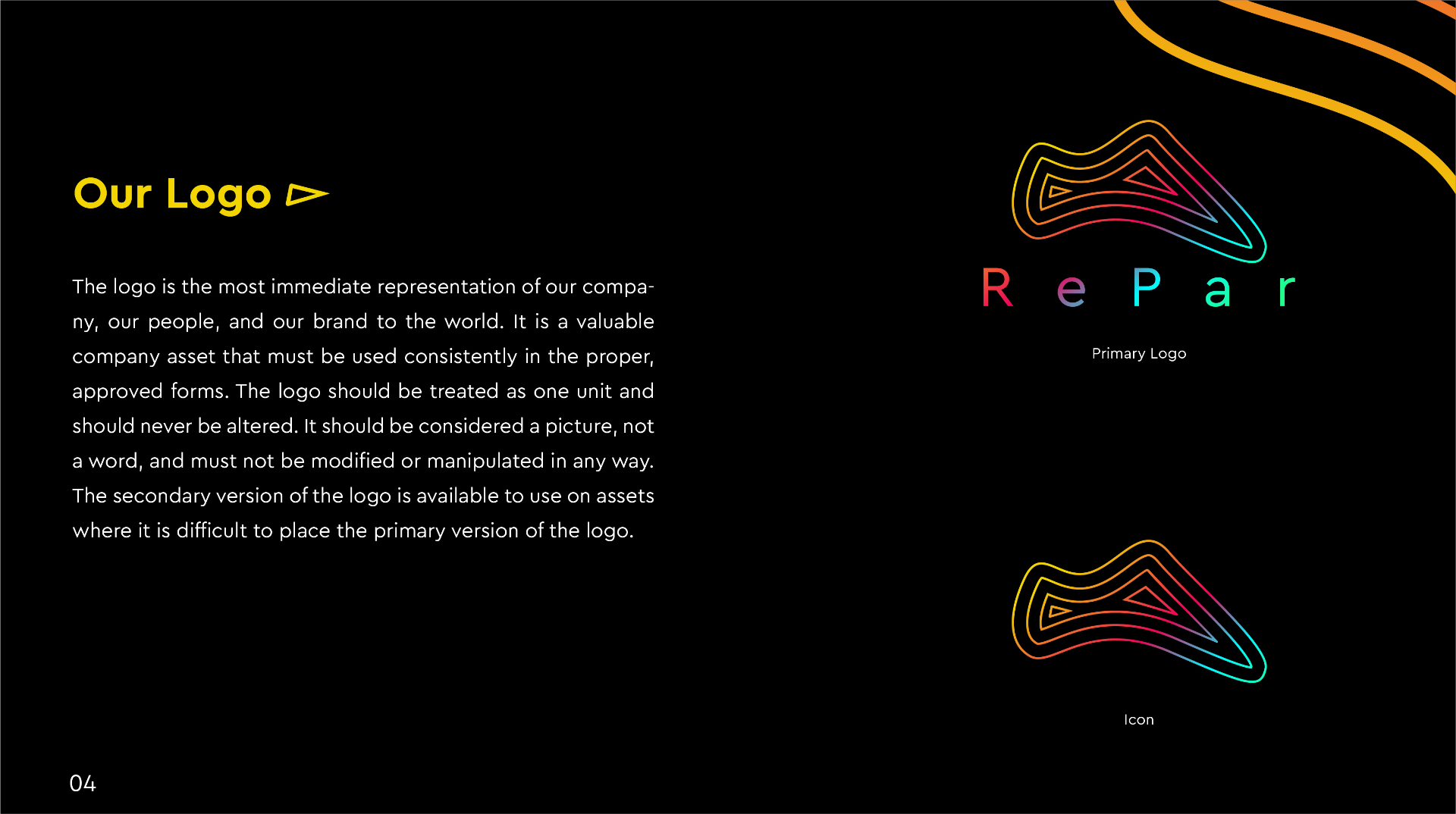
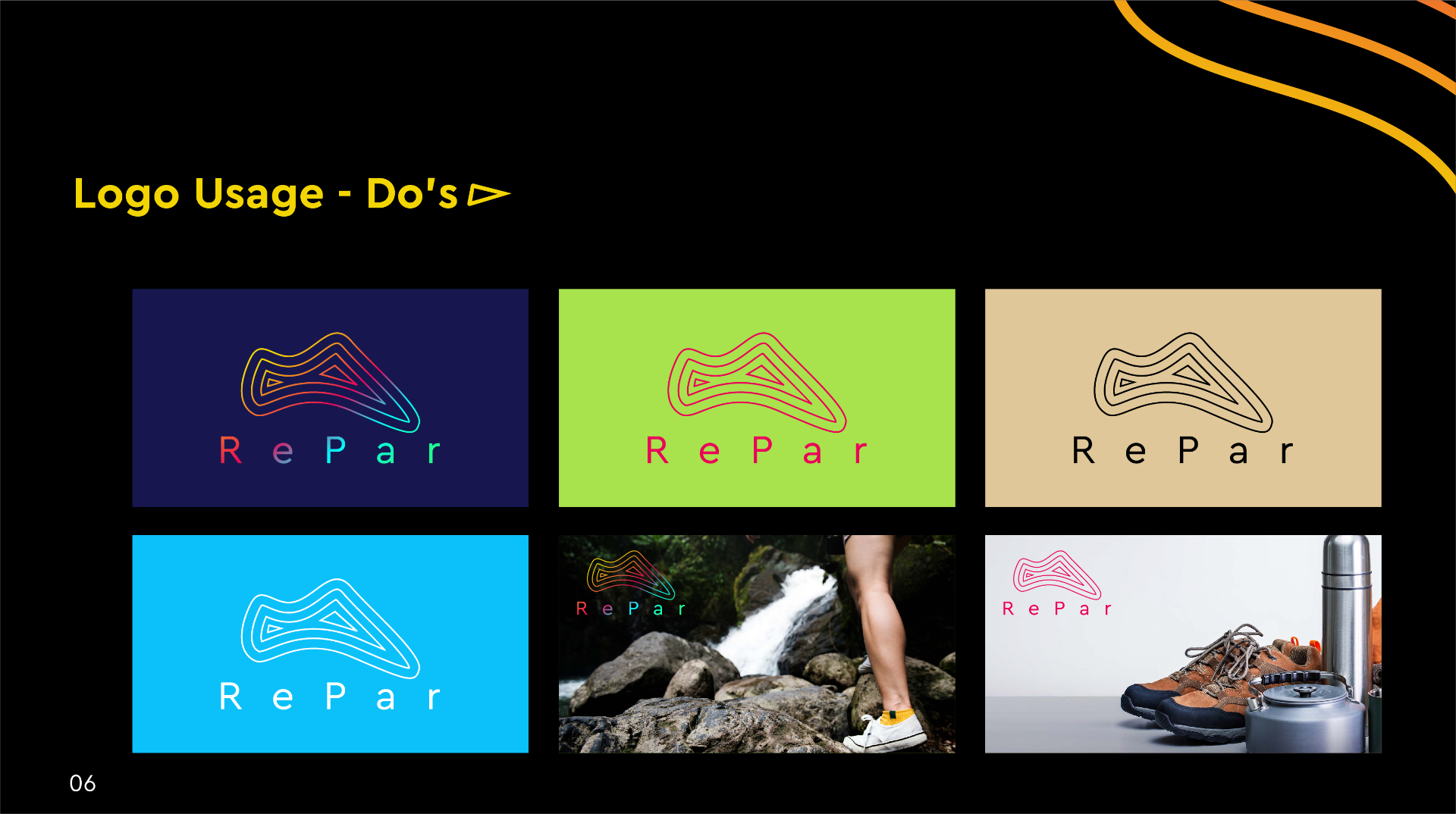
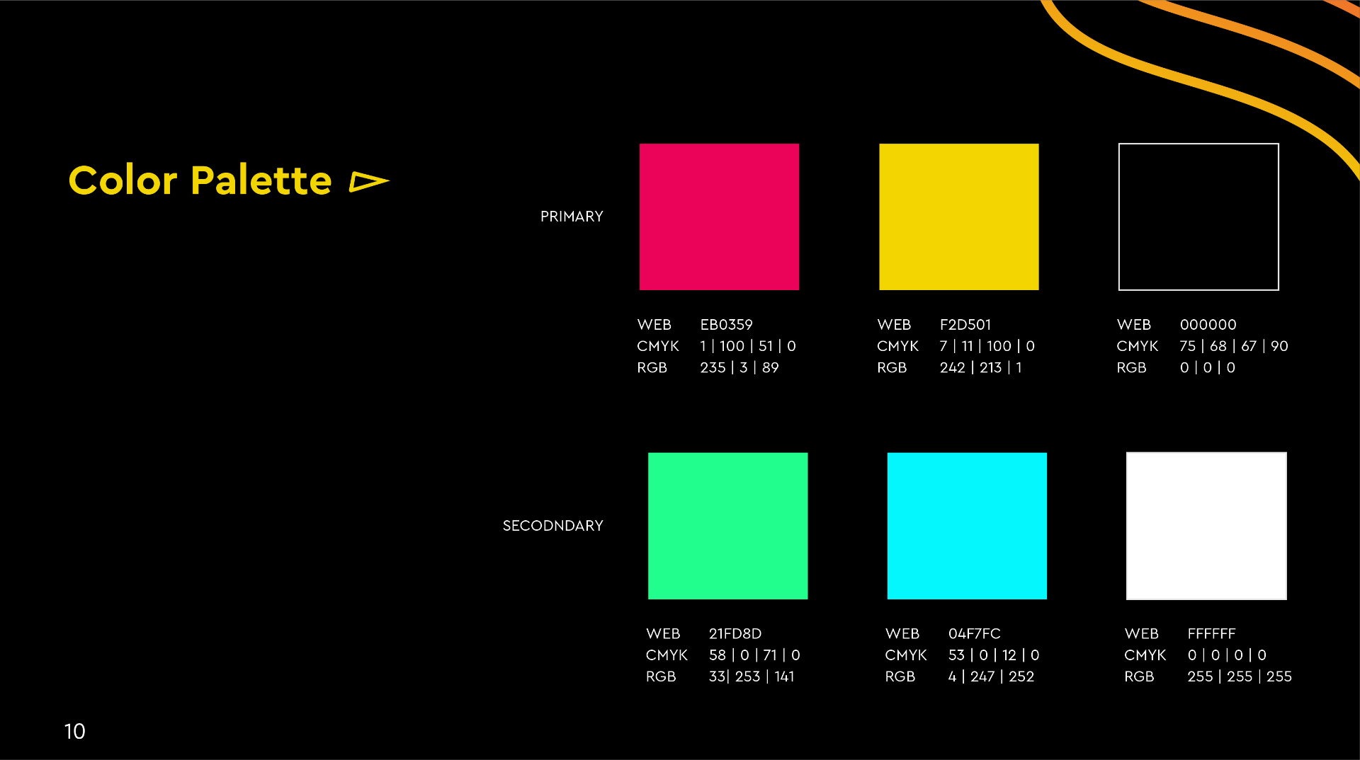
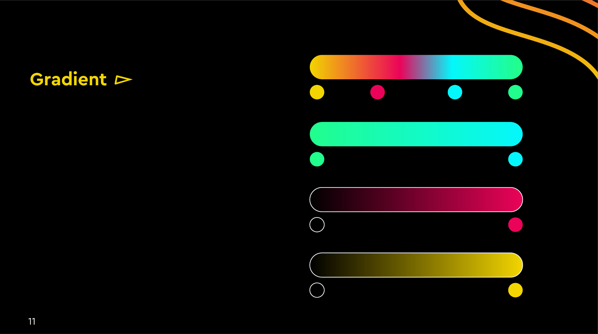
Colour broke every rule the outdoor industry follows. Where every competitor defaulted to muted earthy tones, the palette moved to a full spectrum gradient running magenta, yellow, green and cyan across the icon. The wordmark carried the same logic, setting each letter in its own colour rather than one flat brand shade. Cera Pro was chosen for its geometric precision, a typeface that reads technology and modernity rather than trail gear, which was exactly the shift the brand needed to make. A complete brand guideline system followed, covering logo variations, colour ratios, gradient combinations, typography hierarchy, clear space rules, minimum size, favicon states from 128px down to 32px, and logo usage do's and don'ts.
04 — System
Every touchpoint carrying the same visual language.
- ◆Primary logo and topographic mark
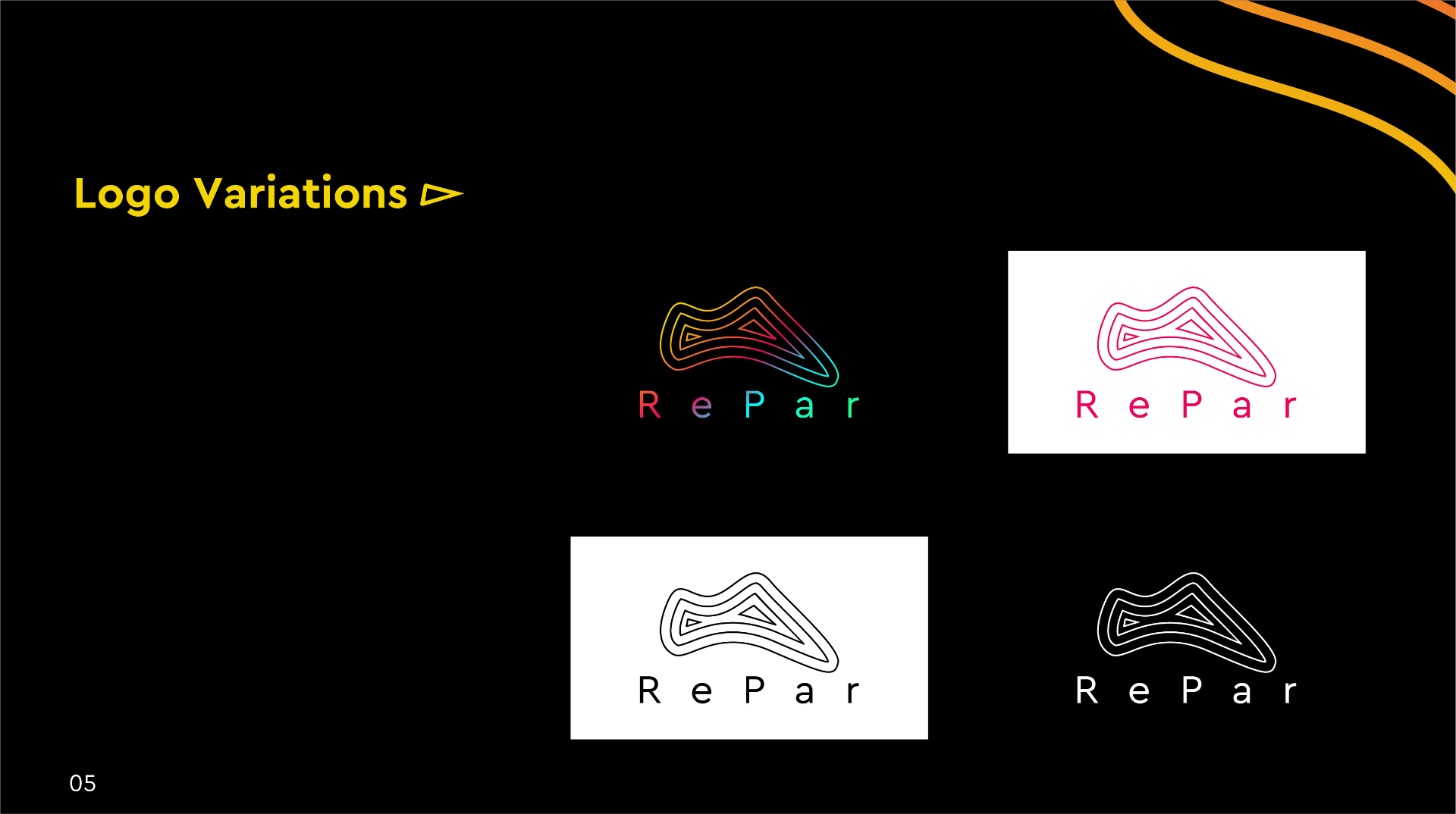
- ◆Full logo suite (mono, reversed, icon-only)
- ◆Full spectrum gradient colour system
- ◆Cera Pro typography hierarchy
- ◆Clear space and minimum size rules
- ◆Favicon states (128px to 32px)
- ◆Logo usage do's and don'ts
- ◆Complete brand guidelines document
05 — Result
"This one is the winner. It looks great!"
Continue