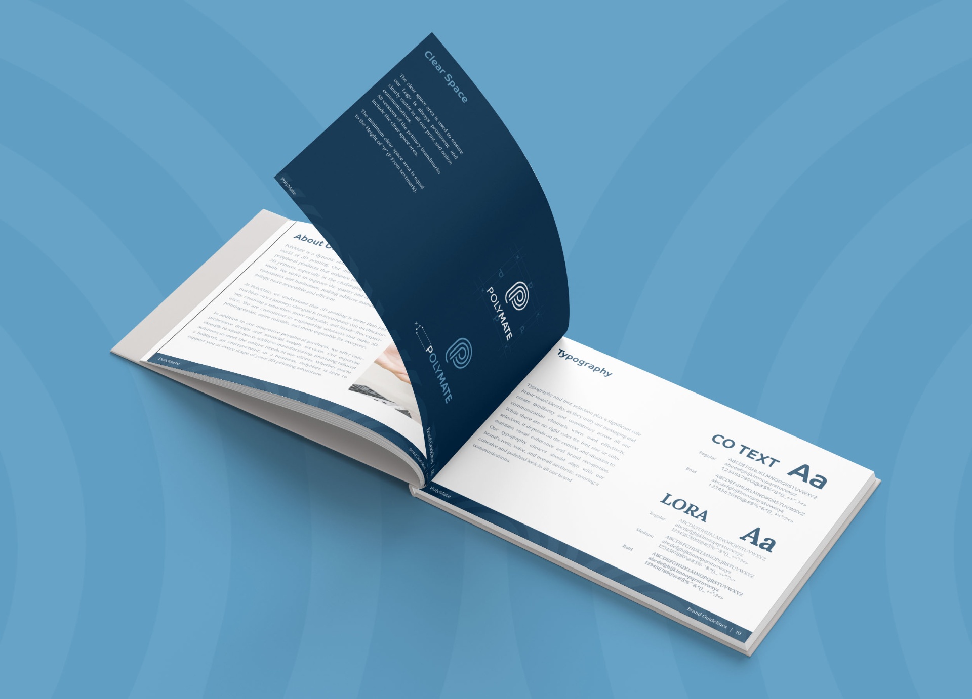
Case Study 03
POLYMATE
Precision, layered.
Client
PolyMate Private Limited
Sector
3D Printing Technology
Region
Singapore
Year
2024
Role
Brand Identity, Guidelines, Stationery
01 — Challenge
A sharp technical proposition with no identity to carry it into the room.
PolyMate Private Limited is a Singapore-based technology startup building peripheral products that make 3D printing more reliable and accessible, particularly in the demanding climates of the global south. A company with a genuinely underserved market needed an identity that could communicate precision, engineering credibility and the kind of forward-thinking personality a young startup needs to attract both clients and partners. Starting from nothing, the brief was to build a mark that felt technical and minimal without being cold, and that would hold up on invoices, receipts and every print application from day one.
02 — Approach
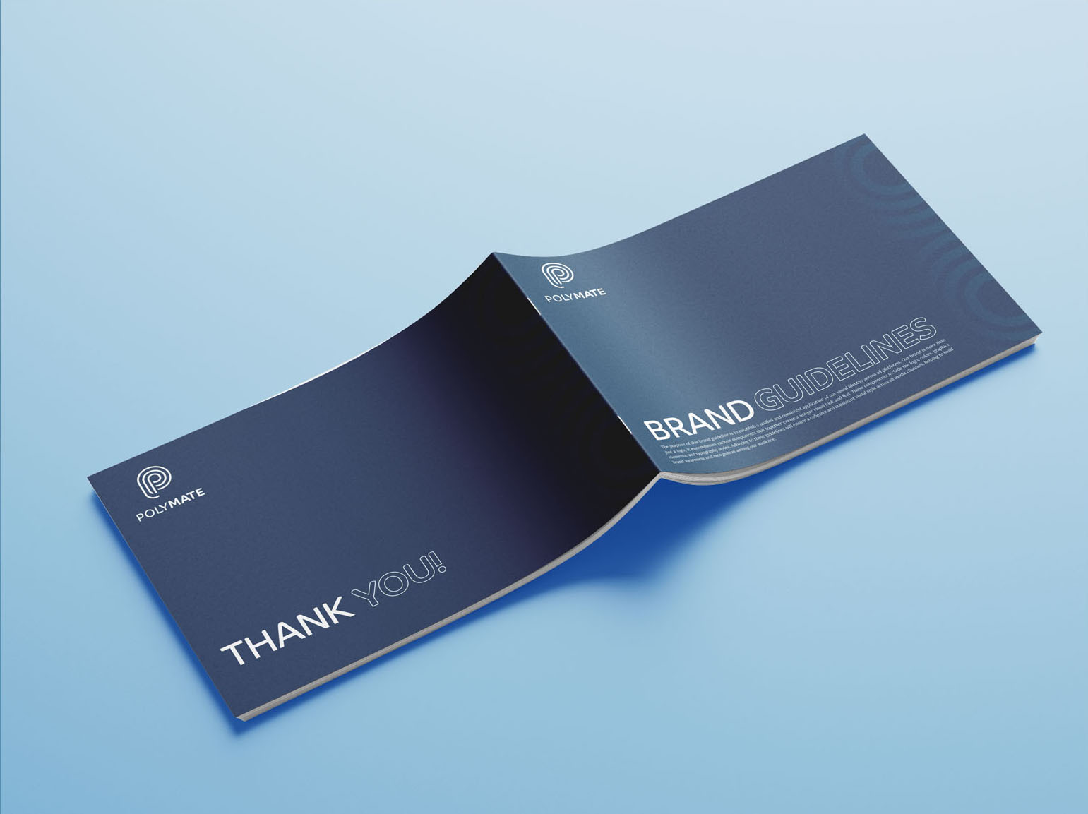
The filament spool and the letter P share the same geometry.
The brief pointed toward an engineering feel with a connection to 3D printing without being literal about it. The filament spool is the most fundamental object in the 3D printing world and it shares its basic geometry with the letter P, a circular form with a vertical spine. Building the mark around that double reading meant the connection to the industry was embedded in the letterform itself rather than added on top of it as decoration. The P was constructed from layered concentric curves rather than a single solid stroke. Multiple parallel lines follow the form of the letter and step inward toward the centre, referencing both the winding of a filament spool and the kind of technical precision associated with engineering. The strokes were kept open-ended with rounded tips rather than closed or sharp, a deliberate choice that communicates adaptability and open design philosophy while keeping the mark feeling approachable rather than industrial. The wordmark was set with the P and M bolded within POLYMATE, creating a subtle visual emphasis on the two syllables that make up the brand name without breaking the consistency of the type.
03 — Solution
One solid navy. No fades. Built to print cleanly from day one.
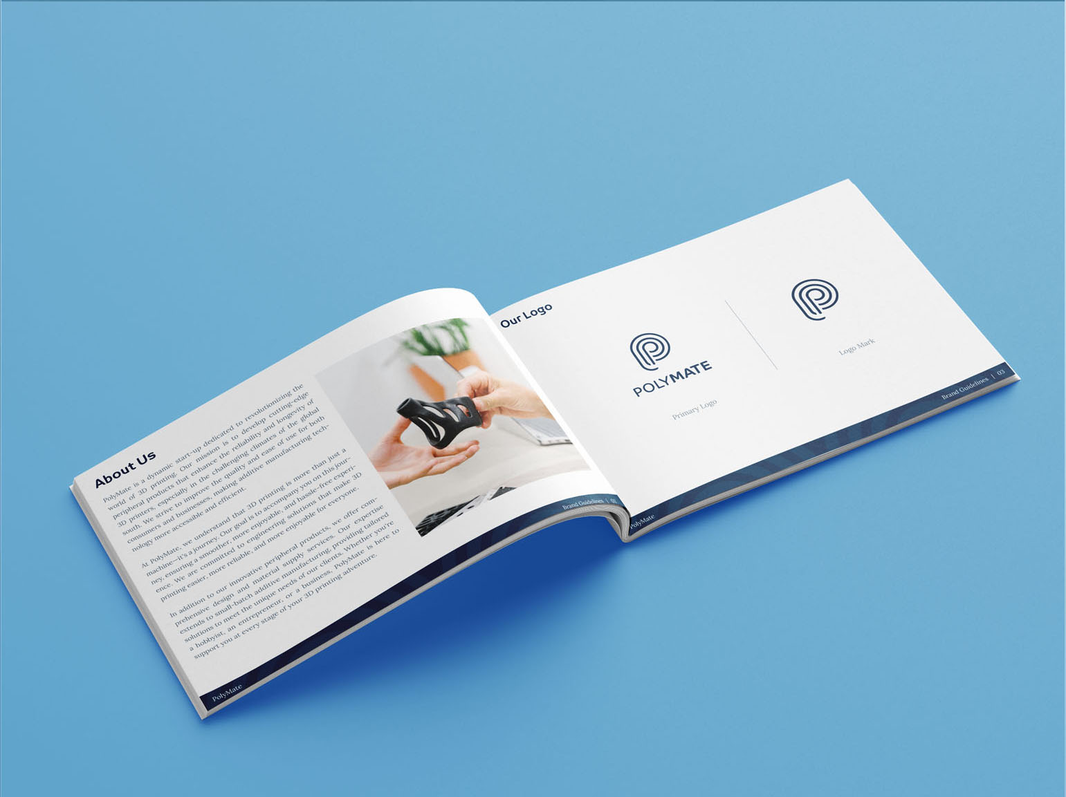
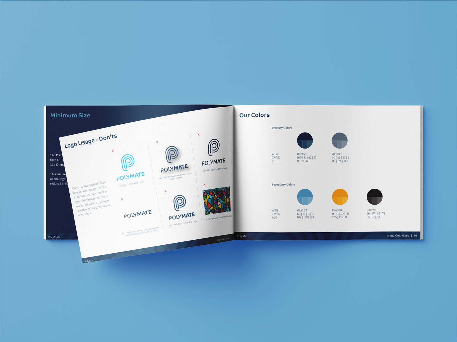
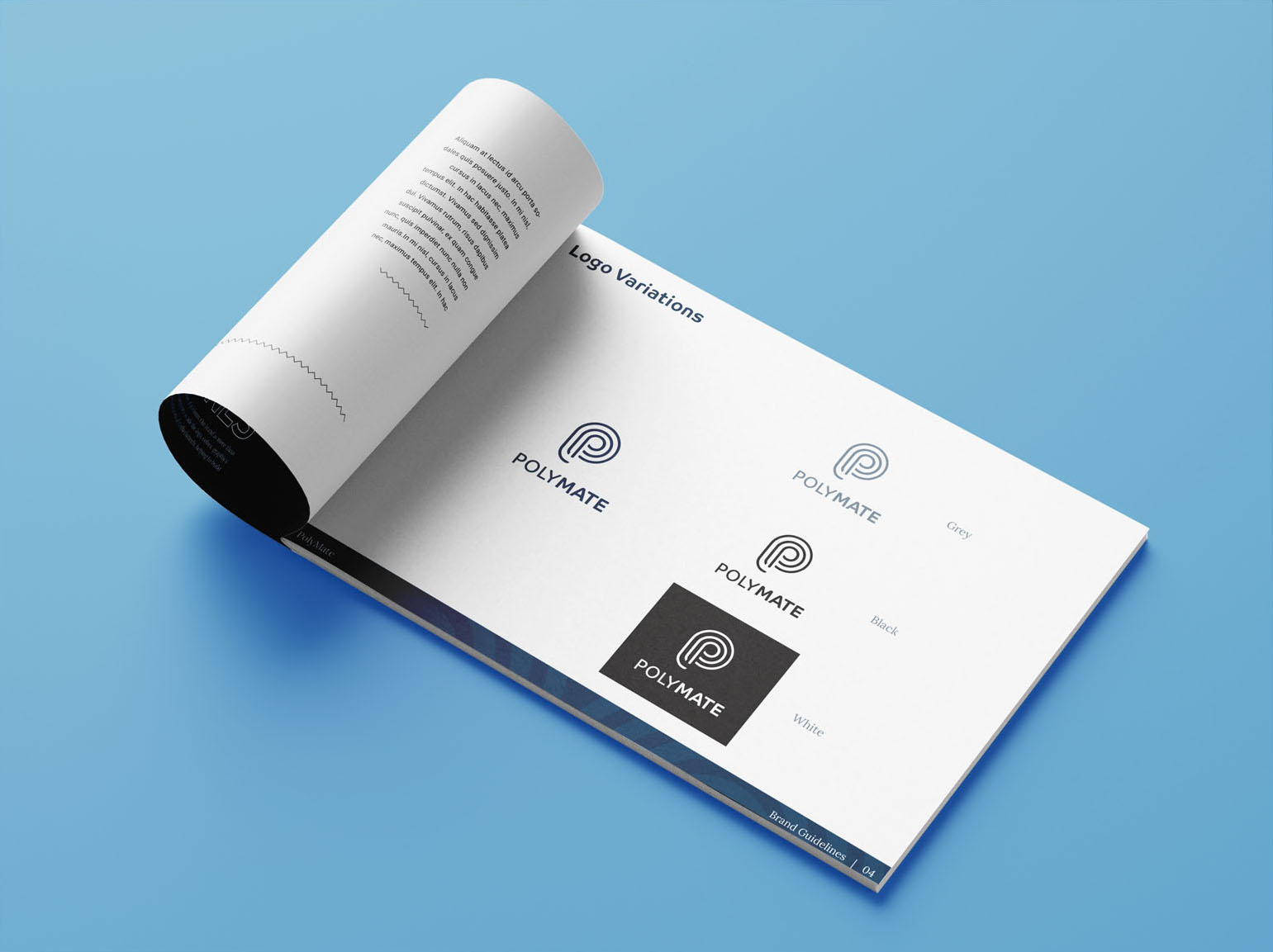
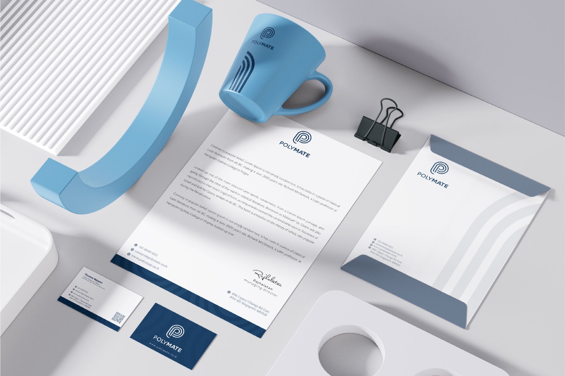
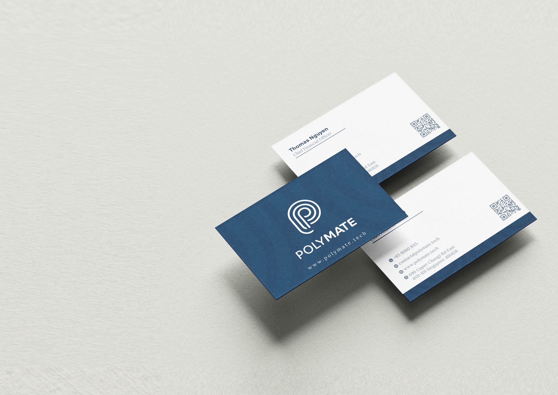
Colour was resolved to a single solid, dark navy 003153. The brief was explicit. Flat, no fades, no feathering, something that reproduced cleanly on white paper. Dark navy was the right call because it carries technical authority without the coldness of pure black, and it gives the mark enough weight to hold up at small sizes on business documents. A full brand guidelines system followed. Logo and icon-only versions, logo variations across dark, light, black and white backgrounds, colour palette with primary and secondary values, logo usage do's and don'ts, minimum size rules and a typography system. A complete stationery suite covering business cards, letterhead and envelope, all formatted for clean print reproduction on white paper from day one.
04 — System
Every touchpoint carrying the same visual language.
- ◆Primary logo and icon-only mark
- ◆Full brand guidelines document
- ◆Logo variations (dark, light, black, white)
- ◆Primary and secondary colour palette
- ◆Typography system
- ◆Logo usage rules and minimum size specifications
- ◆Business cards, letterhead and envelope
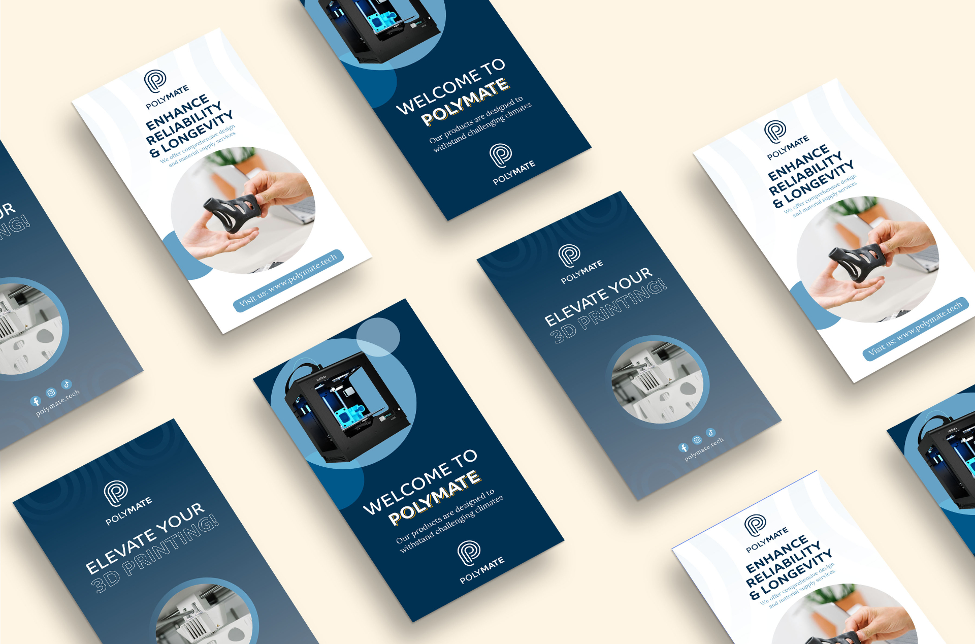
- ◆Social story templates
05 — Result
"Navid delivered a gorgeous-looking logo and a detailed guide on how to get our brand out. I would love to recommend Navid to anyone I know who is in the market looking to have a logo or a brand identity."
Continue