Case Study 07
ATMOSPHERE MEDIA
Your story. Amplified.
Client
Atmosphere Media
Sector
Marketing Agency
Region
Texas, USA
Year
2023
Role
Brand Identity, Guidelines, Website
01 — Challenge
A marketing agency whose own brand did not look credible.
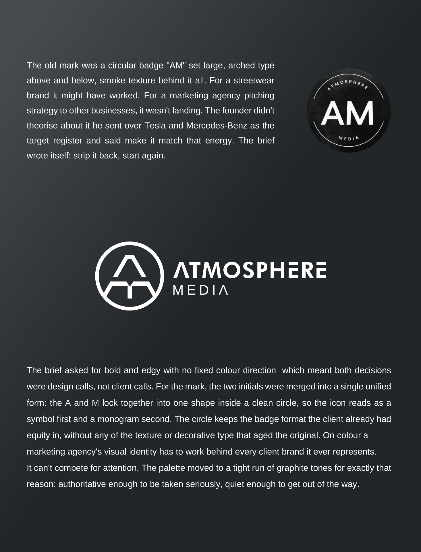
Atmosphere Media had been telling other businesses how to build their brand for years. Their own brand was not doing the same job. The existing mark was a circular badge, an AM monogram set large inside a smoke-textured ring with arched type above and below. It looked like a heritage streetwear label. For a marketing agency pitching strategy and storytelling to other businesses, it was sending completely the wrong signal. A company whose entire value proposition is making other brands look credible had a brand that did not look credible itself.
02 — Approach
Strip it back. Merge the initials. Let the palette get out of the way.
The brief pointed toward bold and reduced. No colour mandate was given so colour became a strategic decision rather than a personal one. A marketing agency's visual identity has to sit behind every client brand it represents without competing for attention. That single insight drove the palette toward a tight run of graphite tones, authoritative enough to be taken seriously, quiet enough to get out of the way. For the mark, the two initials were not placed side by side as a conventional monogram. Instead the A and M were merged into a single unified form so the icon reads as a symbol first and a monogram second. Enclosed in a clean circle, it keeps the badge format the client already had equity in while stripping out every element that dated the original.
03 — Solution
A unified AM mark inside a clean circle, running on graphite.
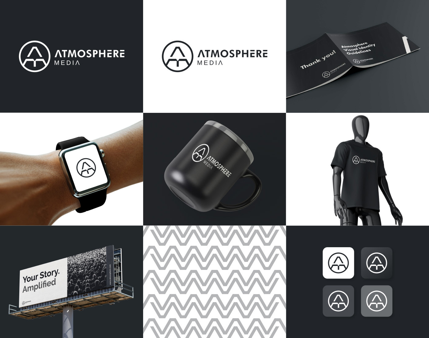
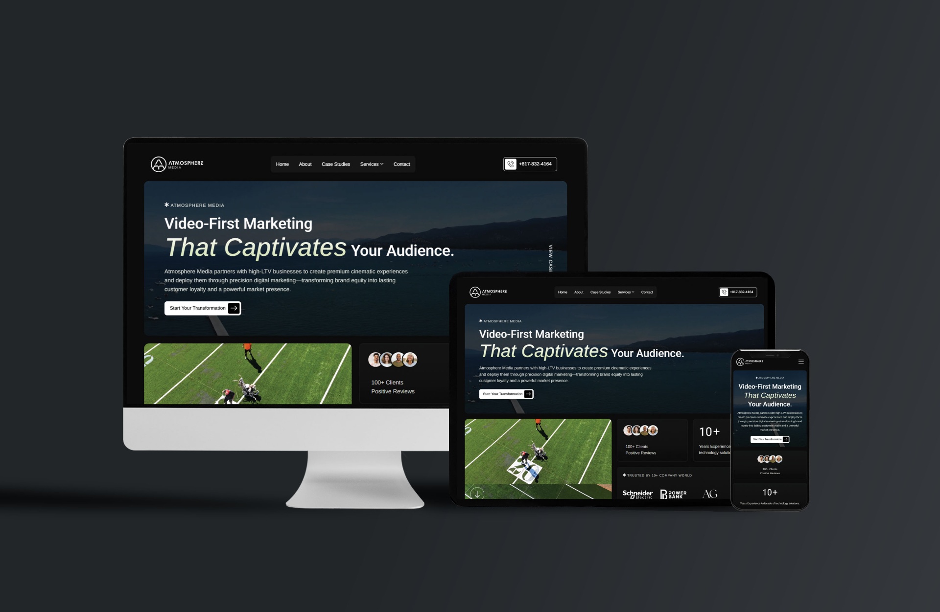
A unified AM monogram rebuilt as a single architectural form inside a clean circle. A graphite palette running from near black through two mid-tones, chosen to position the brand as a professional partner rather than a competing visual presence. Futura PT for the wordmark and headline weight, paired with Arimo for body and supporting text. A full brand identity system covering logo construction, clear space, minimum size, misuse rules, colour ratios, gradient pairings, supporting graphic elements, a pattern language, type scale, app icon and favicon states. A website redesign followed the same system end to end.
04 — System
Every touchpoint carrying the same visual language.
- ◆Unified AM monogram and wordmark
- ◆Full logo suite and construction rules
- ◆Graphite colour system and ratios
- ◆Futura PT and Arimo type hierarchy
- ◆Pattern language and supporting graphics
- ◆App icon and favicon states
- ◆Brand identity guidelines document
- ◆Website redesign
05 — Result
"This is very cool!"
Continue